
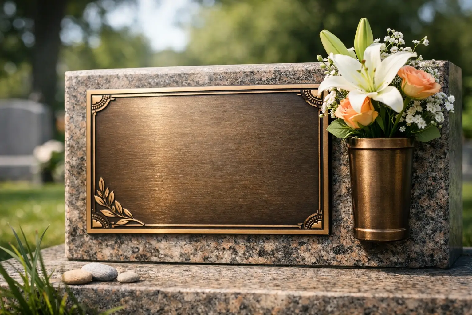
A name cast in bronze carries a particular gravity. It catches the low light of a churchyard, rests quietly against stone, and changes almost imperceptibly with the seasons. Thoughtful bronze memorial plaque design gives that permanence a fitting form: not simply a record of dates, but a measured expression of a life, a family, a community or an act worth remembering.
For a private grave, a chapel, a historic building or a civic place, the finest plaques feel inevitable within their setting. Their lettering can be read with ease; their proportions are calm; their material has been selected to age with dignity. Achieving this apparent simplicity calls for close attention to language, scale, relief, finish and the character of the surrounding architecture.
Bronze memorial plaque design begins with place
No memorial exists in isolation. A plaque set into pale Carrara marble requires a different visual weight from one mounted on dark granite, weathered travertine or the brickwork of a public building. The colour and grain of the supporting material, the direction of sunlight, the viewing distance and the atmosphere of the site all shape the design.
In a cemetery or sacred setting, restraint is often the most eloquent choice. A warm brown bronze with a softly burnished edge may sit beautifully against veined marble, while a darker patina can establish quiet contrast on lighter stone. For a civic memorial, the plaque may need greater scale and a more pronounced relief, particularly where it must remain legible from a pavement or entrance court.
The relationship between bronze and stone deserves careful study. Bronze brings depth, warmth and the possibility of sculptural detail. Stone gives the work architectural presence and a sense of continuity with its surroundings. Together, they can create monuments to memory that are both tactile and composed.
Proportion before ornament
A plaque can be richly detailed without becoming crowded, but ornament should always follow proportion. The dimensions of the plaque should allow the inscription to breathe, with sufficient margin around the text and a hierarchy that guides the eye naturally from name to dates, dedication and any additional words.
A long inscription on a small format often produces lettering that is too fine to remain clear over time. Conversely, an oversized plaque on a modest memorial can feel imposed rather than integrated. There is no universal ideal size. It depends on the stonework, the length of the wording and whether the plaque will be encountered at close range or across a wider space.
Borders can provide definition, particularly on plain or expansive stone surfaces. A fine raised line, a recessed frame or a classical moulding may be appropriate. Yet an unframed plaque can be equally compelling when its silhouette, lettering and patina have been considered with precision.
The inscription is the heart of the work
Memorial language is concise by necessity, but this does not make it easy to compose. A full name and dates may be enough. A professional title, a quotation, a line of prayer or a reference to family can add a more personal note, provided the text remains clear and does not compete with itself.
The most resonant inscriptions tend to avoid excessive explanation. They offer a point of recognition and leave room for reflection. In family memorials, formality may be softened by a familiar phrase. For institutions, the tone often calls for greater sobriety, recording a gift, an event, a restoration or the contribution of a notable individual.
Typography is not a decorative afterthought. Roman capitals carry a timeless authority and are particularly well suited to bronze and stone. Their classical proportions have long been used in commemorative architecture because they remain dignified and readable. Other typefaces can be appropriate, especially where a modern building or a person’s own identity suggests a different visual language, but novelty should be approached with care.
Raised lettering creates shadows that support legibility and gives the plaque a physical, sculptural presence. Incised lettering offers a quieter effect, often suited to intimate plaques or refined architectural interiors. The choice is partly aesthetic, but it is also practical: weather exposure, contrast and maintenance requirements should inform the decision.
Relief, symbols and portraits
An image can bring a memorial closer to the individual or the place it honours. A cross, an olive branch, a family crest, a regimental insignia, a trade emblem or a botanical motif may carry meaning without requiring further words. In sacred and heritage contexts, symbols should be researched carefully and placed with an understanding of the wider architectural language.
Portrait reliefs require particular sensitivity. A likeness should be recognisable, but it should not feel mechanically reproduced or overly literal. The best relief portrait has depth of modelling and a clear relationship to the scale of the plaque. A highly detailed image on a small surface can lose its character once viewed outdoors; a simplified profile or medallion may prove more enduring.
Decorative motifs should never reduce the inscription to an afterthought. The hierarchy remains clear: memory first, image and ornament in support. This is especially true when bronze is paired with dramatic natural stone, whose veining or texture may already provide visual movement.
Patina is part of the design, not a final coating
Bronze is valued not only for its strength but also for its capacity to mature. Its surface responds to air, moisture, touch and time. A plaque may begin with golden brown warmth, deep chestnut tones or a near-black finish, then develop a more complex surface character over the years.
A controlled patina gives the maker a considered starting point. Brown, dark umber, green and blackened tones each create a different relationship with the inscription and adjacent materials. A warmer patina may harmonise with aged limestone or traditional marble. A darker finish may suit contemporary granite or a restrained civic façade. Green patina can be beautiful, though it needs to be used in sympathy with the building and local conditions rather than as a decorative gesture.
This natural evolution is part of bronze’s appeal. It also means that a memorial should not be judged solely by the day it is installed. The aim is a material composition that will continue to acquire character, rather than one dependent on a perfect, unchanging surface.
Detail determines durability
Lasting beauty depends on technical decisions that are rarely visible once the plaque is in place. The bronze alloy, casting quality, depth of relief, edge treatment, fixing method and drainage around the supporting stone all affect performance.
Outdoor plaques must be fixed to accommodate the distinct behaviour of bronze and stone over changing temperatures. Hidden mechanical fixings may preserve a clean appearance, while visible decorative studs can become part of the design. The appropriate solution depends on plaque size, substrate condition, access for future conservation and the requirements of the site.
Where a memorial is installed on historic fabric, intervention should be minimal and reversible where possible. Existing stone may be fragile, salt-affected or structurally sensitive. Such work calls for the judgement of specialists able to assess both the material and the significance of the place before any drilling or mounting begins.
Maintenance is usually modest, but it should be gentle. Abrasive cleaners and aggressive polishing can remove the very patina that gives bronze its depth. Dust, biological growth and surface deposits may require professional attention, particularly on plaques in damp, coastal or heavily polluted environments. A conservation-minded approach protects both the bronze and the stone surrounding it.
Bespoke work carries a different responsibility
A standard plaque may fulfil a practical need, but a bespoke commission can respond to the particularity of a life and location. It allows the inscription to be composed around the dimensions of the stone, the typeface to be selected with care, and every junction between materials to be resolved rather than improvised.
For Torchio Marmi, this approach belongs to a longer tradition of Italian craftsmanship in which material knowledge and artistic judgement remain inseparable. Bronze, marble, granite and steel each speak differently. The work is to let them speak together, with design at the service of memory rather than fashion.
Before approving a design, it is worth viewing it at true scale whenever possible. A drawing can establish proportion, but a full-size layout reveals whether lines are too close, whether capitals have sufficient presence and whether a symbol has the right visual weight. This final pause often makes the difference between a plaque that is merely correct and one that feels settled in its place.
A memorial need not say everything. It need only say what should endure, in a material capable of carrying that message forward with grace.